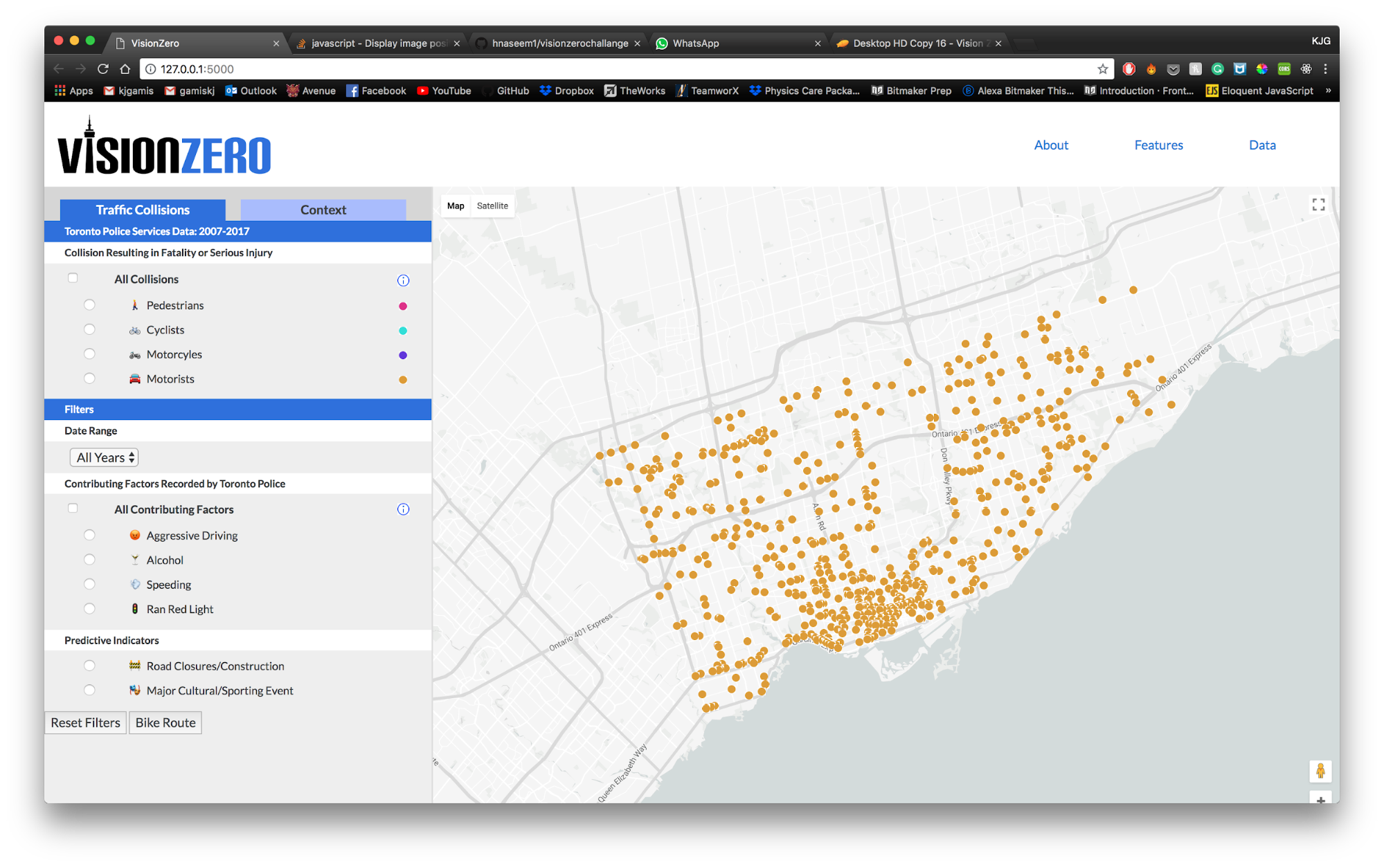
Toronto Vision Zero Map
I led a 7-person team in a three-month-long hackathon called the Vision Zero Challenge. Our web mapping tool earned us first place, a six-month-long fellowship with Civic Hall Toronto, and inspired the design of the City’s own internal tool.
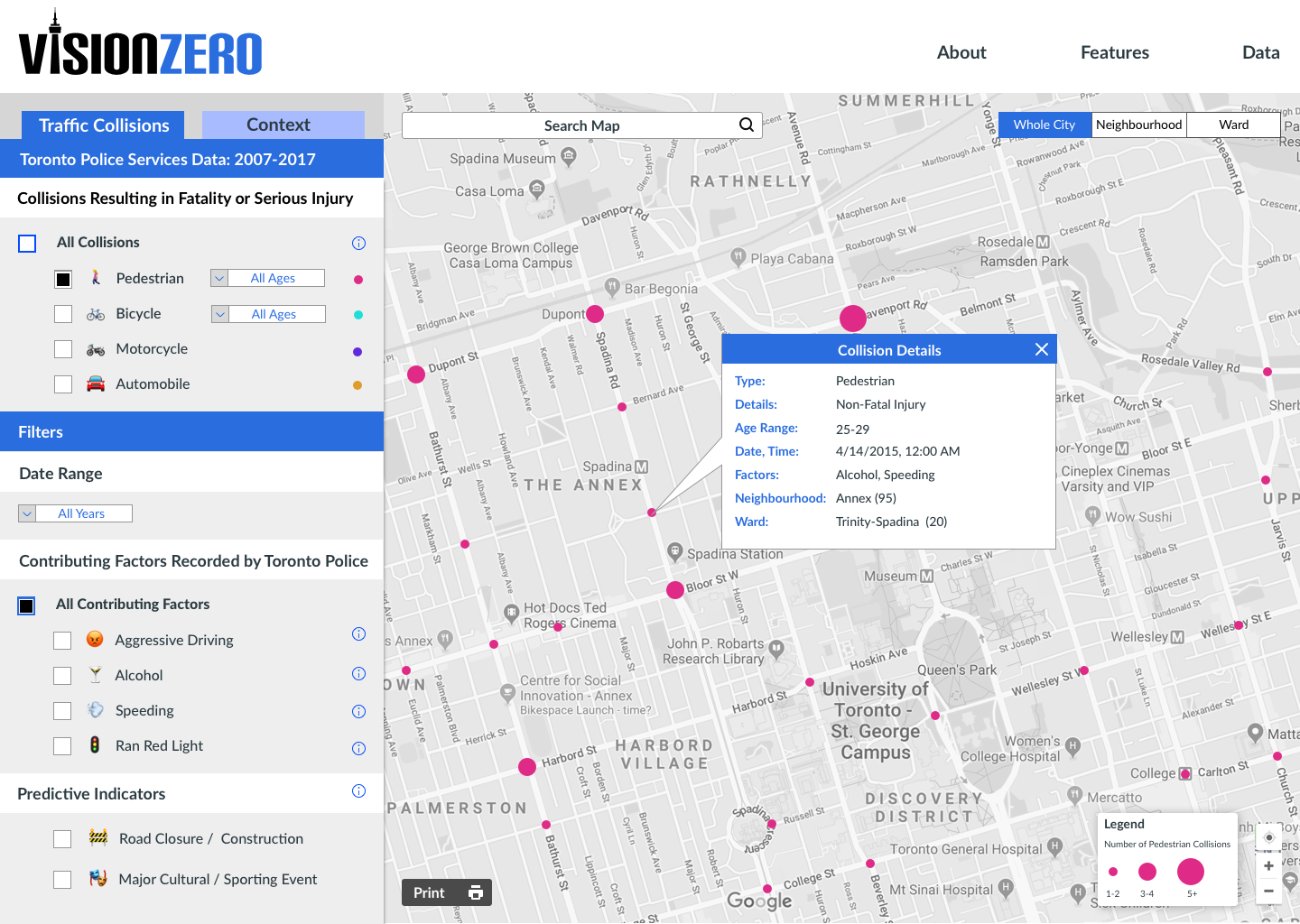
The Toronto Vision Zero Map is a web map tool for City staff, politicians, non-profit employees, and activists to view and compare data sets related to traffic collisions as well as predictive indicators our team developed using Bayesian analysis. The intent of the map is to make it easier for decision-makers to access the data they need to improve road safety for all.
The hackathon challenged us to use "use data, design and technology to make all Toronto road users, especially seniors, newcomers and school children, safer immediately, and enable predictive and high-priority interventions in the future."
Team: Gustavo de Mattos (Back-End Developer), Hasan Naseem (Back-End Developer), John Spragge (Data Analyst), Karen Gamis (Front-End Developer), Ollie Sheldrick (User Researcher), Sheneille Patil (UX Designer).
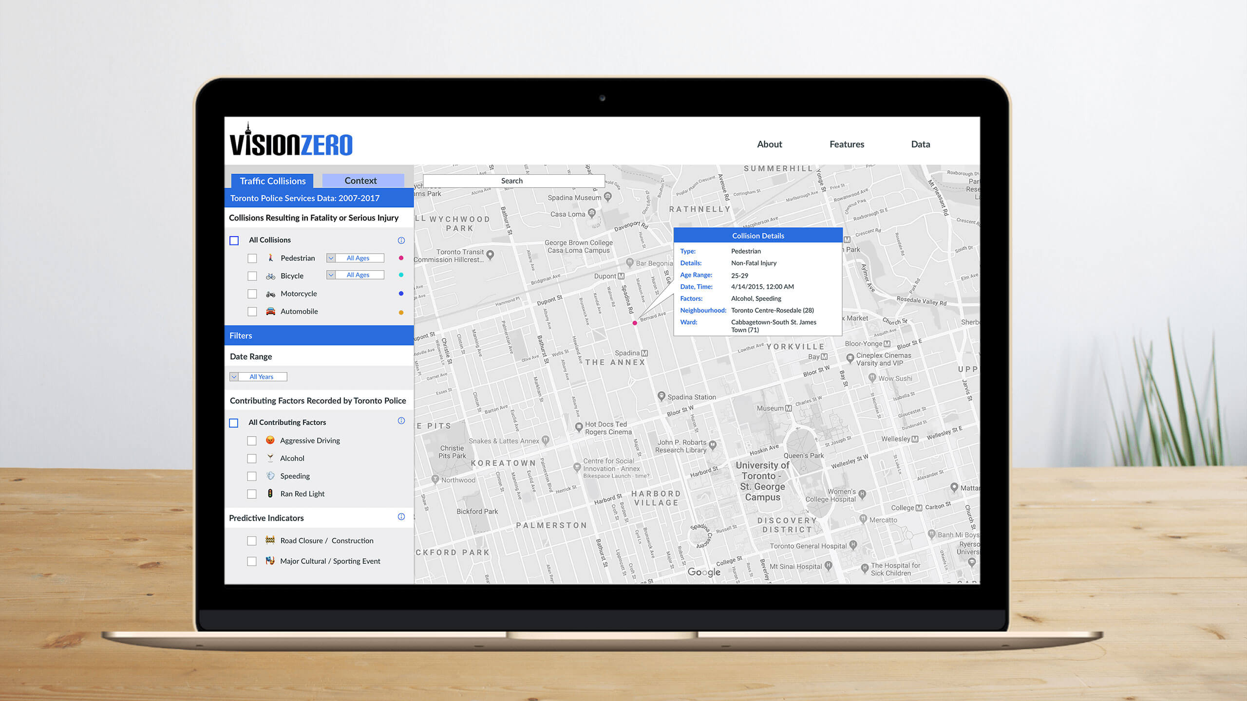
Our working prototype uses Toronto Police Services Open Data Portal, which includes all traffic collisions where a person was either killed or seriously injured (KSI) from 2007-2017 and displays it on a base map generated using the Google Maps API. Data can be filtered by year and by contributing factors as recorded by Toronto Police Services.
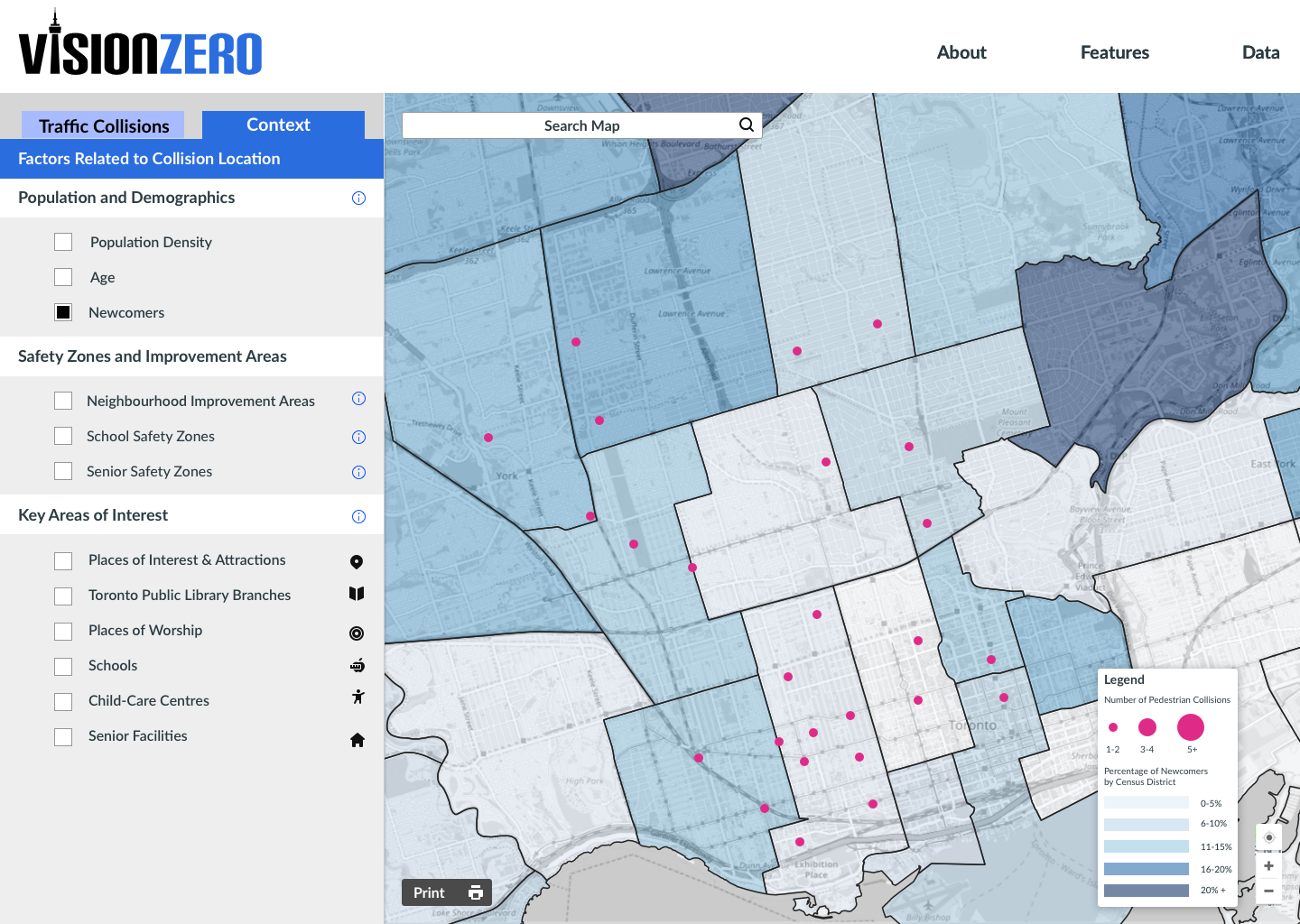
It also has the potential with further development to allow for the comparison of collision data with population and demographic statistics and key areas of interest. This feature is important because it highlights the areas of the city with the highest concentration of newcomers, school children, older adults, and at-risk populations.
The hackathon was sponsored by the City of Toronto and Ryerson University’s Brookfield Institute for Innovation + Entrepreneurship and took place in summer 2018.
VISION ZERO CHALLENGE
Vision Zero is a road safety concept that originated in Sweden in 1997 that is based on the premise that no loss of life is acceptable. It anticipates that people will make mistakes and prioritizes road safety by lowering driving speeds, improving vehicle design, educating people, and enforcing laws to support safer behaviour on the roads.
The Vision Zero Challenge hackathon challenged teams to “use data, design and technology to make all Toronto road users, especially seniors, newcomers and school children, safer immediately, and enable predictive and high priority interventions in the future.”
UX CHALLENGES
Presented with such a broad problem statement, the first challenge was to decide which group to focus on.
The team took the approach that in order to make seniors, newcomers, and children safer you need to target the people, directly and indirectly, responsible for decision making—a group including not only politicians, but City staff members, activists, and non-profit employees.
Our solution allows them to view, compare, and contrast data without high levels of technical knowledge—it provides them with easy access to information, provides political transparency around decision making, and aids communication between different departments and groups.
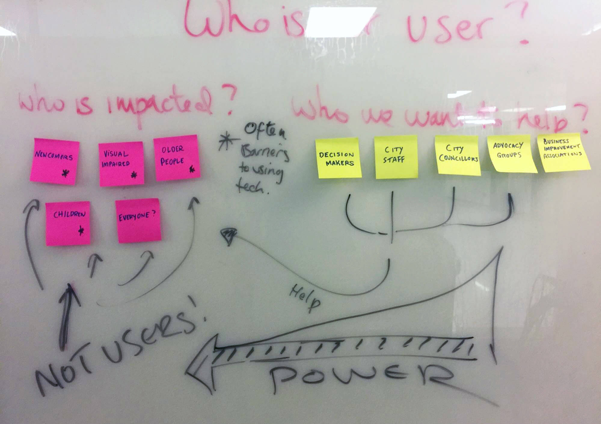
We arranged meetings with members of City staff, business improvement area staff and members of advocacy groups to understand Vision Zero from their perspective.
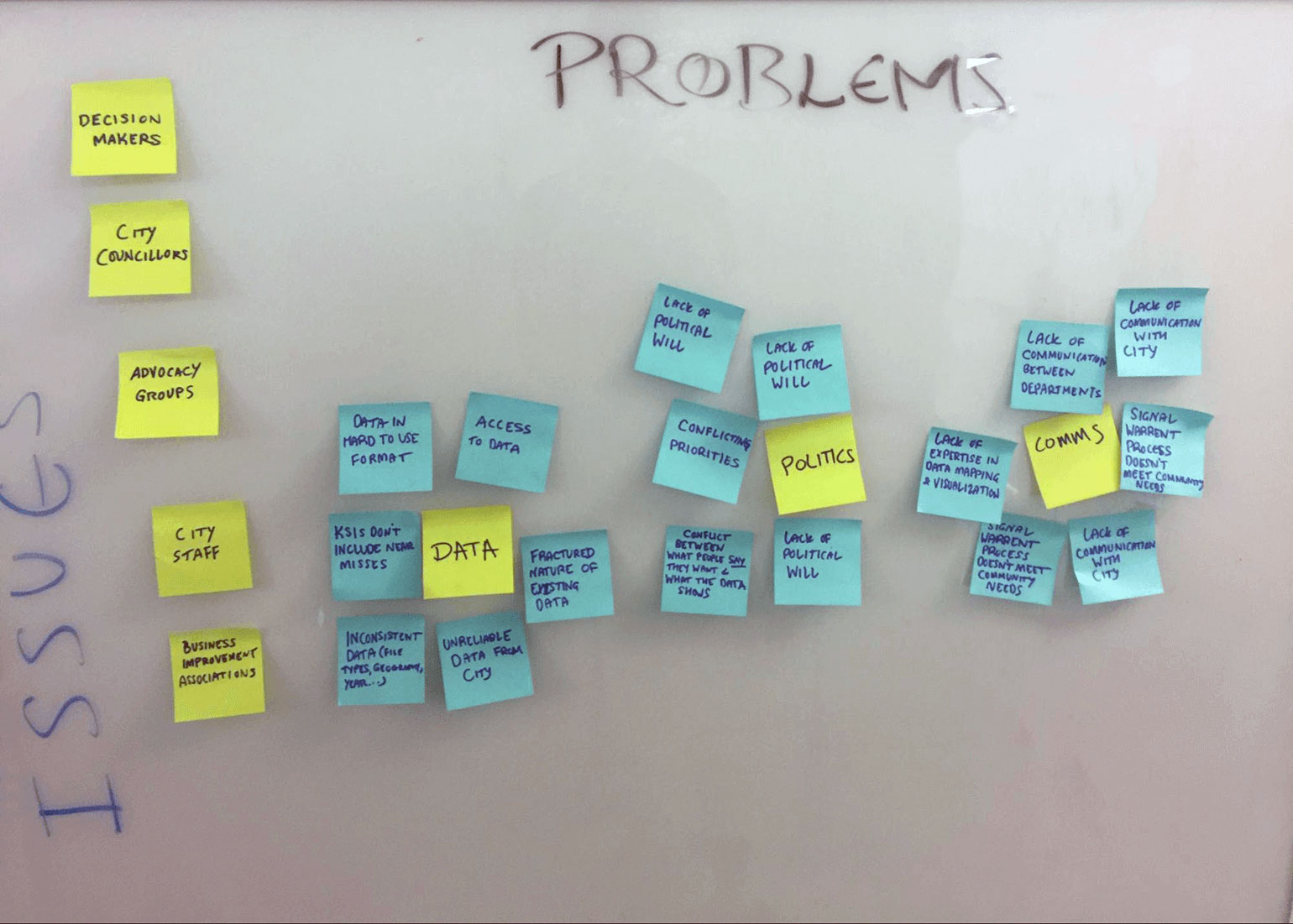
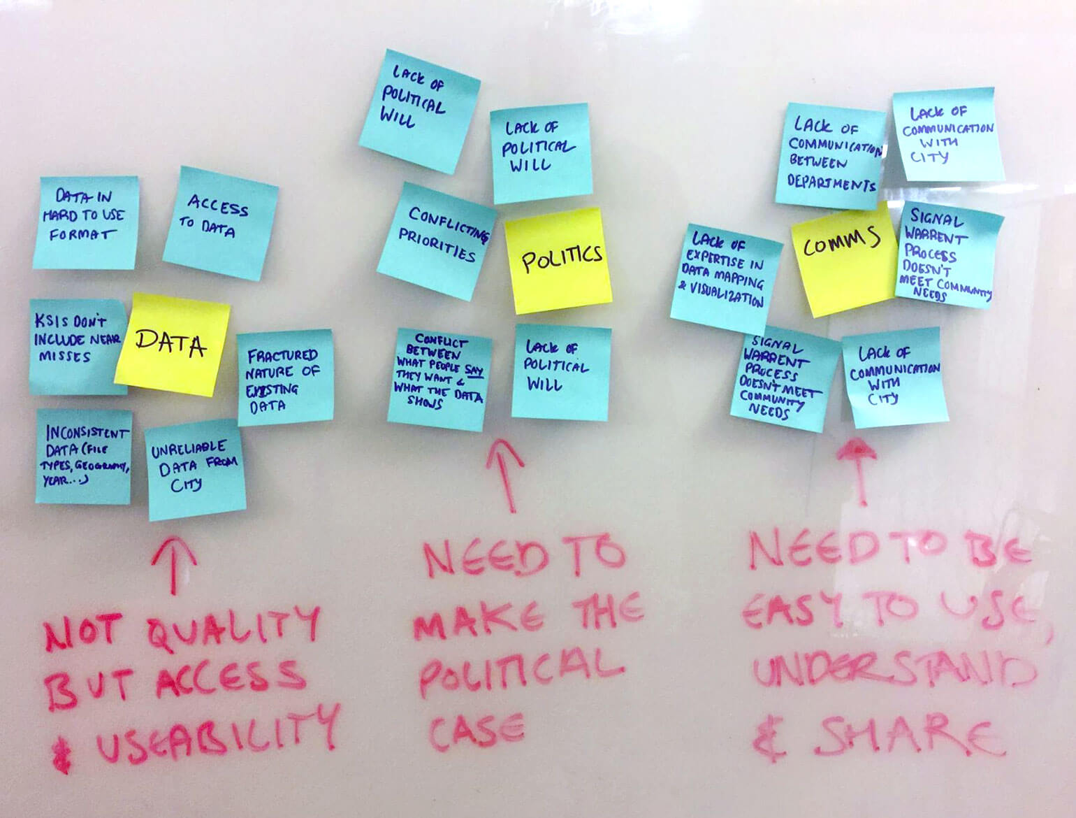
From our user research, we learned that the issue isn’t so much the existence of relevant data but the ability to access and use it in a meaningful way. Political will and conflicting priorities also came up repeatedly.
Data:
People we spoke to often found data hard to find, inconsistent or requiring a level of technical knowledge they didn’t have. Data requirements focused on usability and consistency, not on detailed analysis.
“If open portal data was easily accessible, if it had an online portal that worked like Eco-Counter, that would be really useful. I am able to half-do that analysis, but anyone else that doesn’t have that background, it wouldn’t be possible.” - Interviewee
Politics:
A number of potential users pointed to the importance of political will and visibility when tackling issues of road safety. For many, it was not a fundamental lack of knowledge about how to tackle this issue, but about how we can convince political leadership to shift their priorities.
“Political will is a big part of this, and many councillors get pressured by concerns for traffic flow, drivers etc.” - Interviewee
Communication:
People felt that current processes and channels for communication often slowed work down. There was also the difficulty in using data to communicate issues, and the evidence.
“It doesn’t make sense that everything has to go through their individual departments (cyclists, pedestrians). We need a holistic view.” - Interviewee
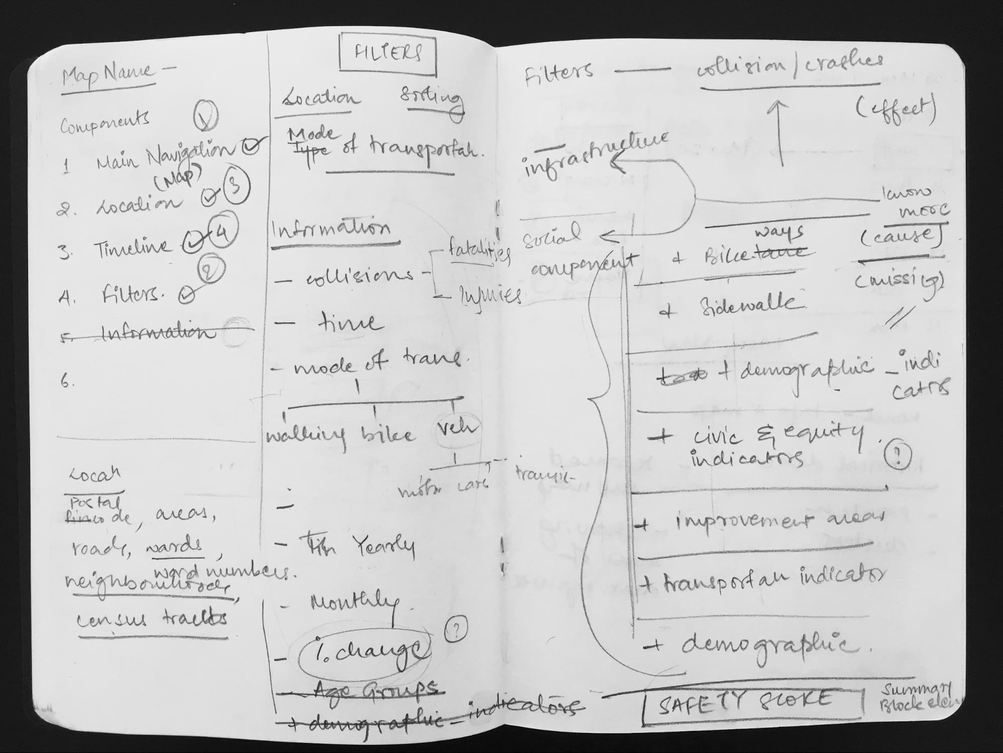
The next challenge was the content strategy. How to determine exactly which data sets to use and how to use them? Teams were provided with access to nearly 100 different datasets including everything from traffic collision data from Toronto Police Services to demographic indicators, to locations of cultural facilities. We first tried to map out how we might filter it but were quickly overwhelmed by the amount of information we had to work with.
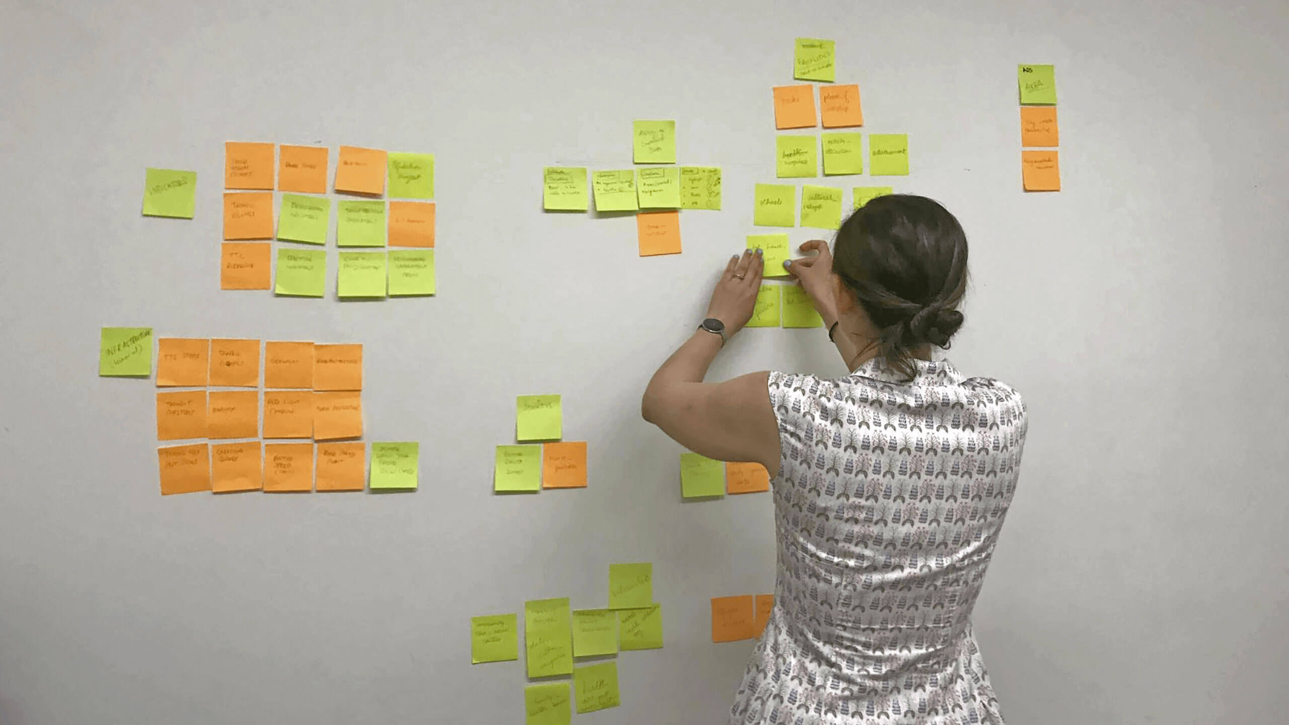
We switched over to affinity mapping to organize and prioritize the information. We wrote out the name of every data set on its own sticky note and arranged them into categories. This allowed us to determine which categories of data were most relevant to our goals.
UX SOLUTIONS
Looking at the evidence we had generated from the user research, the team workshopped a number of potential ideas for how we might design a solution that tackled as many of these issues as possible.
We chose to focus on a web map and dashboard for city employees and other stakeholders where existing data could be easily viewed, compared and contrasted without high levels of technical knowledge. We felt this could alleviate the issue that many users stated regarding the difficulty in finding relevant data, and not being able to use it because they did not have the technical ability.
It would be able to show the data at a council ward level, highlighting the particular challenges facing areas that had direct political governance and accountability. With better and easier access to data, shown at a level that has direct accountability to councillors, we felt that it could help to drive the conversation in the right direction, and provide the city with easy-to-use evidencing of their work.
We looked to other cities web mapping tools for inspiration, including those related to Vision Zero specifically. With a good understanding of best practices and other cities approaches to the subject, I created initial wireframes to guide the team's subsequent work
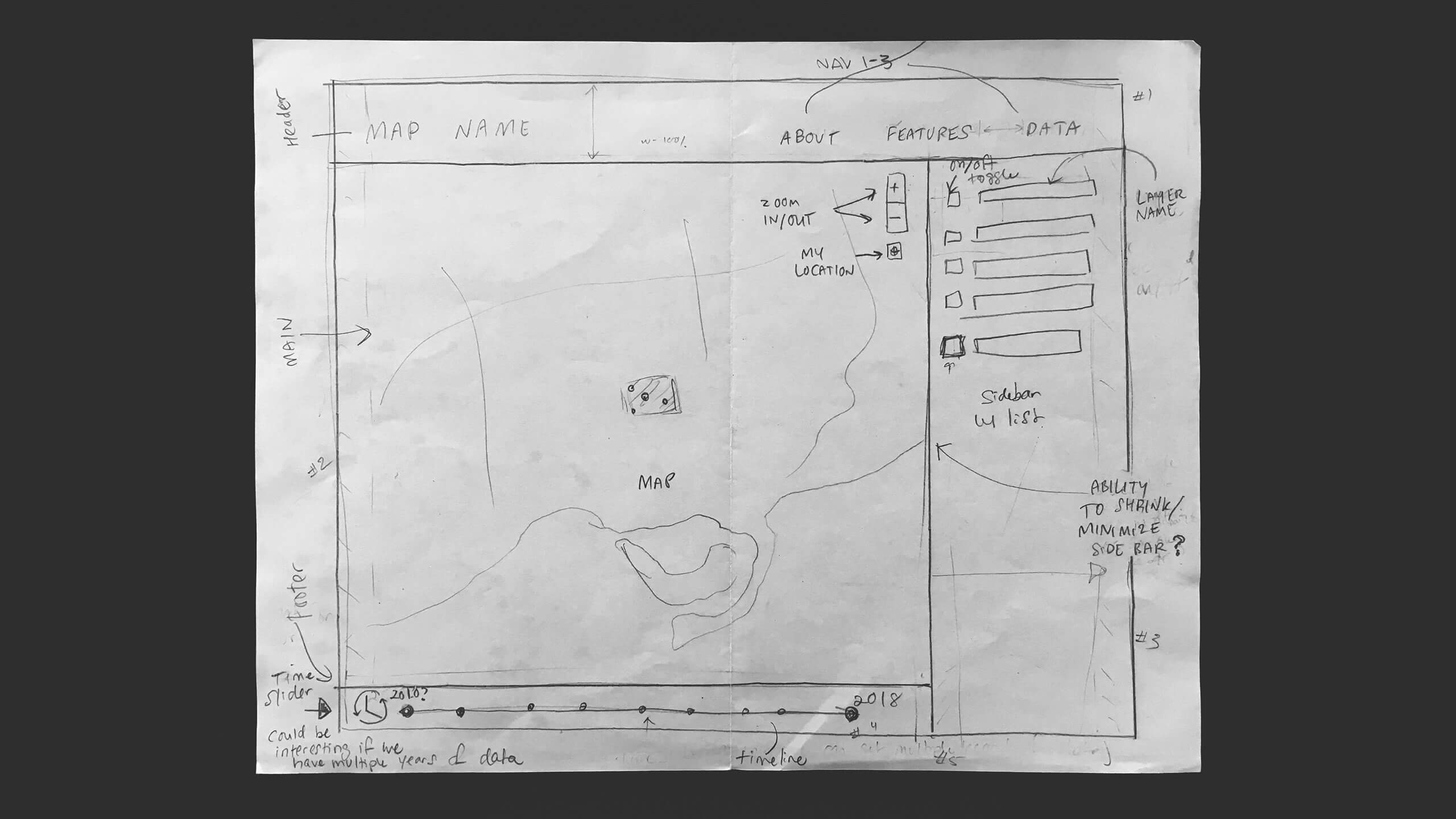
With the basic overall concept in place, the developers were able to get to work establishing the framework, while Shenielle and I continued to refine the design and experience part of the interface.

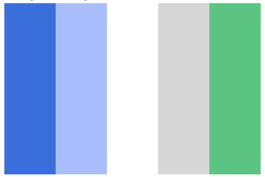
The colour palette is intended to communicate the emotion of ‘feeling safe’. The colour scheme makes predominant use of greys and white, with blues being used as accent colours to highlight important details and filters. Psychologically, grey is a neutral colour while blues convey seriousness, communication, and trust.
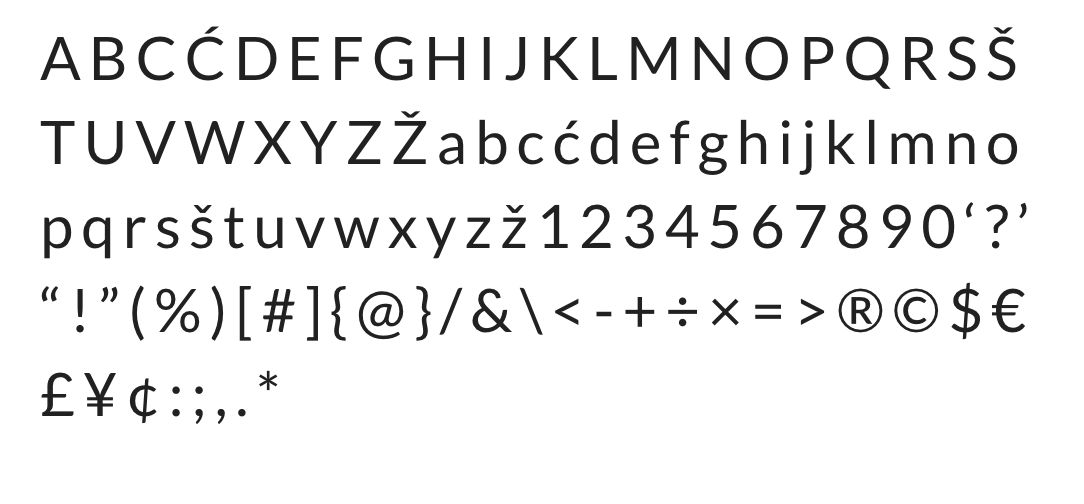
The typography is set in Google Font Lato, which is an easy to read sans-serif font that we feel conveys a feeling of warmth and friendliness along with strength and stability. It’s a free font, which we felt was important for the sustainability of this project, should it be further developed and handed over to the City or non-profit group.
MY ROLE
In my role on the project, I handled project management, led the UX design strategy, and collaborated with the user researcher and UX designer. I delegated responsibility for the development aspect of the project to Hasan Naseem who served as the point person for the work of the front and back end developers.
The three biggest challenges for me as the team lead was making sure that everyone had what they needed to do their best work, finding out what mode of communication worked best for which people, and finding times to meet that worked for everyone to meet.
