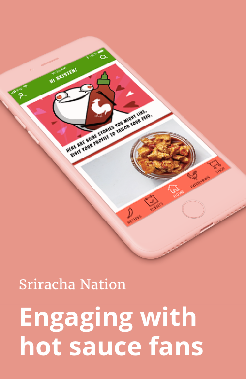
Sriracha Nation
A self-initiated project to develop a social app for fans of Sriracha hot sauce

Objective: Connect and engage with customers through the app
Deliverable: High fidelity prototype of onboarding flow
Timeline: 2 weeks
My role: Strategy, user research, product design, branding, copywriting
THE PROBLEM
How can Sriracha connect and engage with its customers through an app in a way that is consistent with the brand's values?
BRAND RESEARCH
What is Sriracha's brand? The first step in my process was to research everything Sriracha.
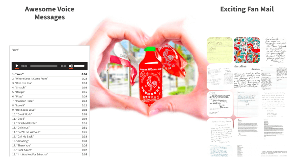
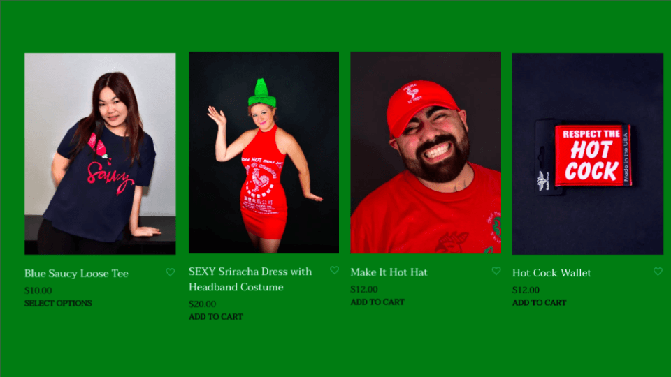
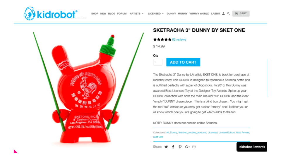
As a long-time Sriracha fan, I already knew that the hot sauce was delicious and has very dedicated fans. But, what I didn't know was that the brand also has a great sense of humour: they have a whole section of their website dedicated to showcasing all the fan mail and voice messages they receive, and their online store is stocked not only with sriracha hot sauces but also irreverently funny clothing and accessories.
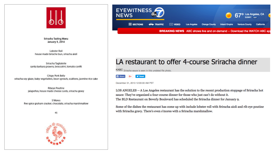
A few years ago when news broke that the factory that produces the hot sauce would have a temporarily halt production, the internet dubbed it the "Srirachapocalypse." In the wake of the shutdown, The BLD Restaurant in Los Angeles hosted a Sriracha tasting menu.
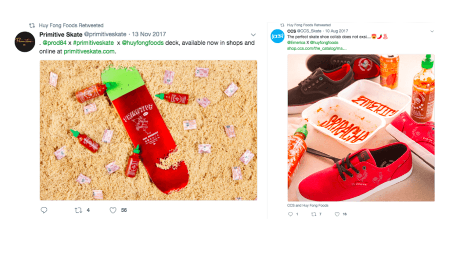
The brand is also well known for collaborations, such as ones with skate brands Primitive and CSS, as well as LA artist Sket One. The webcomic the Oatmeal has even done a homage to the hot sauce in the form of a quiz.
ONBOARDING RESEARCH
An app makes its first impression through the onboarding process. How can I turn the onboarding process into something delightful and fun that is consistent with the Sriracha brand? To answer this question I went to work researching and going through the onboarding of a range of different apps.

The onboarding flows that I found to be most engaging were Slack, Bitmoji, Lego, and Houseparty, which all make it fast and fun to get started with their apps. On the other hand, Foursquare's Swarm app's onboarding feels unnecessarily lengthy and tedious.
Lululemon's shopping app onboarding is efficient and feels exclusive: a good match for the brand.
The natural language employed by apps like Airbnb, Medium, and Wealthsimple to effective and clear.
The quiz format of the onboarding for "The Blender Girl," a smoothie recipe app that prompts users with a few short questions to help them pick the perfect smoothie recipe.
The Lego app's username generator is an elegant solution to protect the privacy of users in an app geared primarily at children. For a random name generator, I think that it comes up with great names and its a fun interactive piece of the onboarding process!
CONTENT
There wasn't time to speak with users in depth about what sort of content they might be interested in seeing in the app, so I used my research into the brand to guide the initial content decisions:
• There is a devoted fan community: what if the app could facilitate local meetups and events?
• There is a lot of interest in cooking with Sriracha, and using it in unexpected ways: what if the app had a recipe section?
• There are existing collaborations with well-known street-wear brands and artists: could the app be used to showcase these and advertise when exclusive products will become available?
• During the "Srirachapocalypse" BLD Restaurant in Los Angeles hosted a Sriracha tasting menu: what if high profile chefs and restaurants could be involved in some way?
I validated and iterated on these assumptions with several rounds of the user testing.
PROTOTYPES + USER TESTING
I did three rounds of user testing with low- and medium fidelity prototypes before going into high fidelity.
FIRST ROUND
Given the short timeframe for the project, I went straight to Balsamiq for the initial wireframes. I put the wireframes into InVision and tested them with three participants.
In this first version, the app began with a carousel of three images highlighting the app's features, followed by a login screen, and ending with a feed of stories and events. Click here to interact with the prototype.
From user testing, I found that users felt that the order of the carousel cards could be improved. Two users suggested that a quiz might be fun as part of the onboarding, with the ability to earn points or win contests or give you tailored recommendations. Another wondered if it would be possible to calibrate their feed through the onboarding process.
SECOND ROUND
I took the feedback from the first round and improved upon the carousel at the beginning of the app, making it more engaging and improving the order of the cards. Click here to interact with the InVision prototype.
I did some hallway testing with this option and quickly learned that users felt that the carousel was unnecessary for a fairly straightforward app. I went back and iterated on the design.
THIRD ROUND
Taking the feedback from the first and second rounds of user testing I further refined the app. Click here to interact with the InVision prototype.
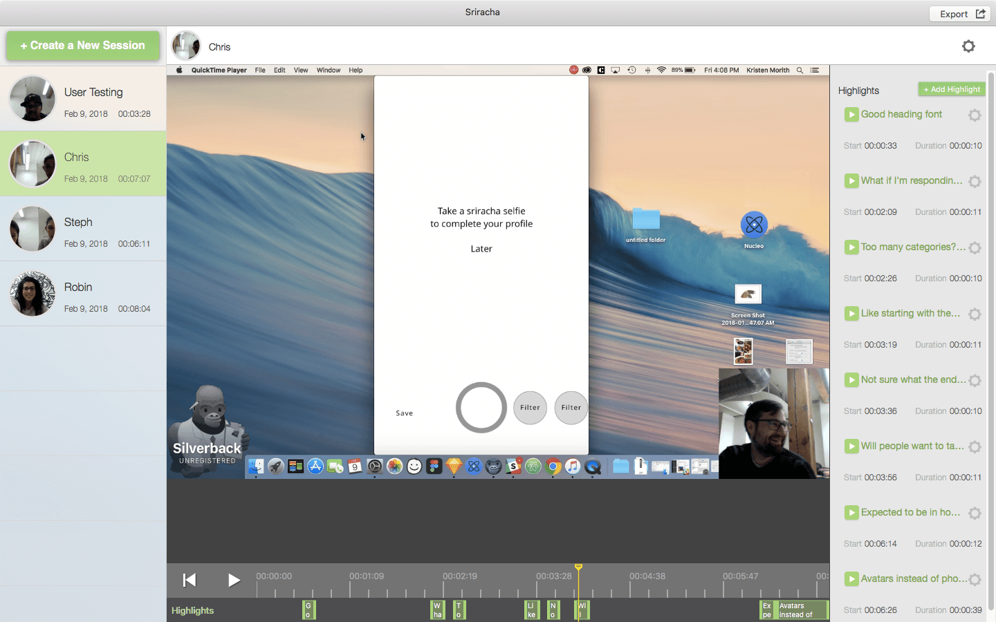
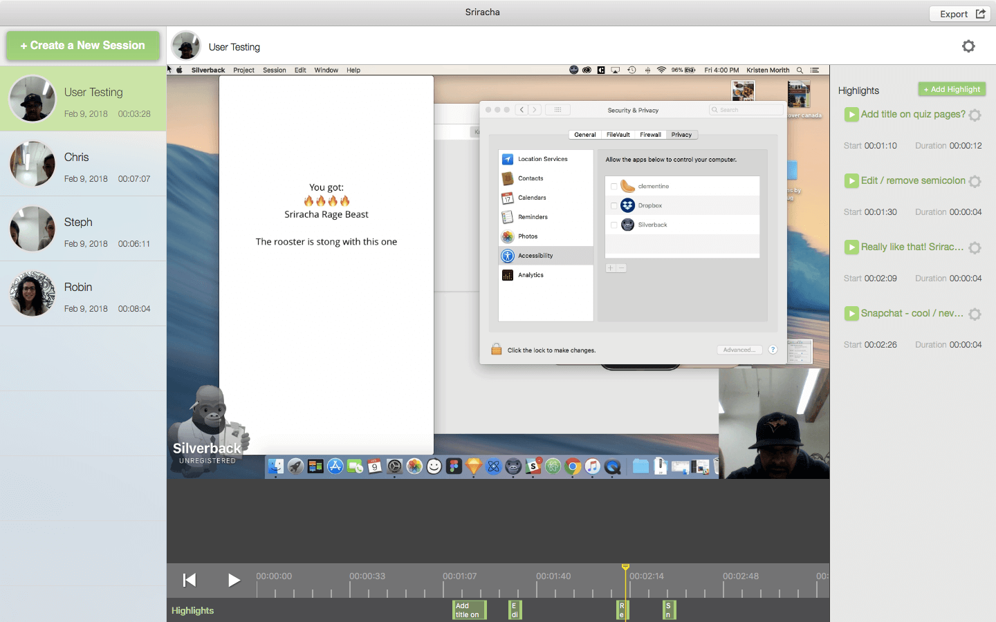
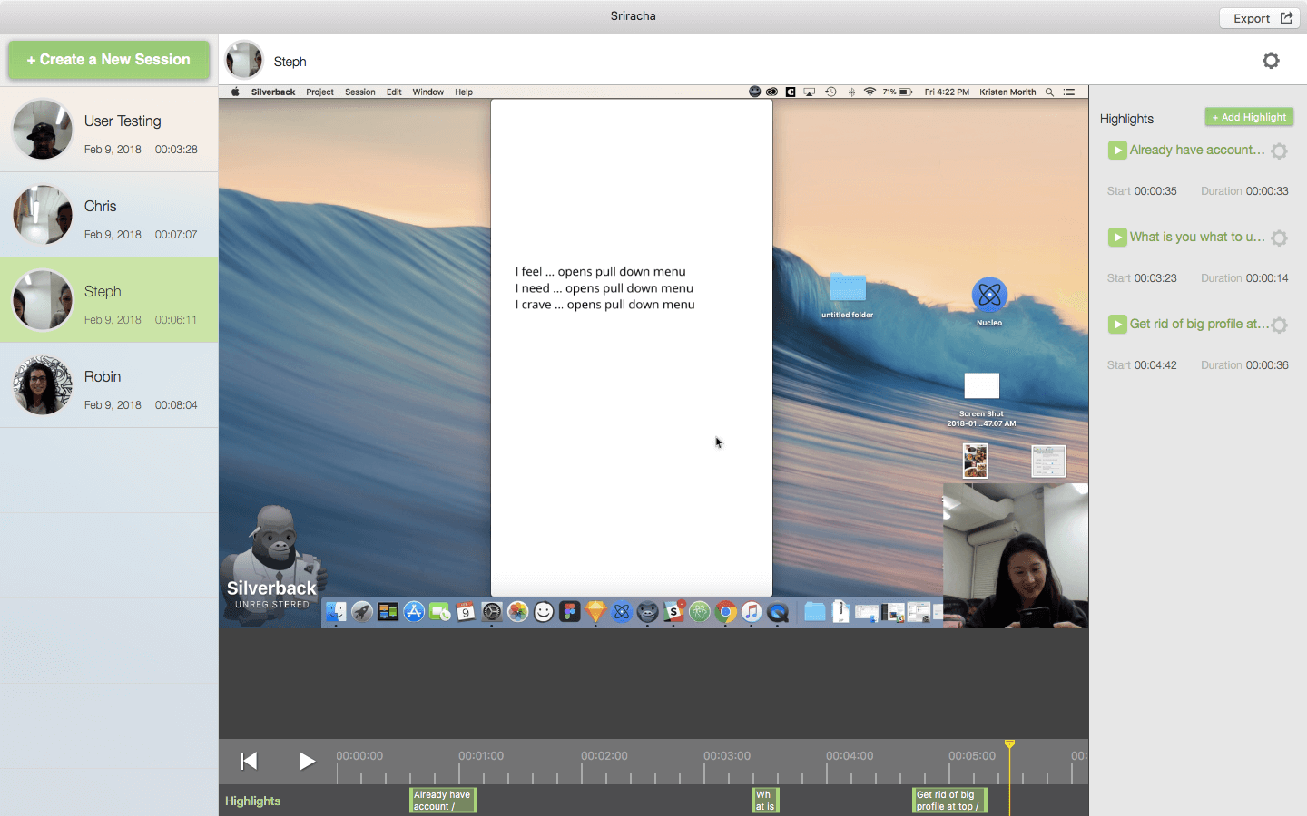
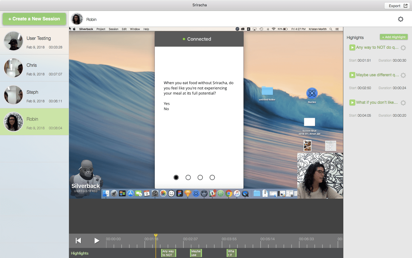
For the third round of user testing, I recruited four participants to interact with the app prototype while I guided them with questions and recorded our sessions using Silverback, a usability testing app for Mac that allows for simultaneous recording of the app prototype and the user tester.
This allowed me to fully focus my attention on my conversation with the users and not on my note taking and gave me the ability to gain insights through rewatching the footage that I might not have picked up on otherwise. As a result of using this method of user testing, I was able to obtain very detailed feedback on what users felt was working and what was not.
I used this feedback to refine the wording and order of the questions in the onboarding quiz. I also removed the option to take a selfie of yourself with Snapchat-like filers to use as your profile picture because most users felt apprehensive about it. Additionally, from the feedback I received, I changed the way users would access the app if they already had an account -- I moved this button up to the first screen of the app so it's not necessary to go through the onboarding quiz in order to log in.
The images below show screenshots from the Silverback user testing footage.
HIGH FIDELITY PROTOTYPE
The several rounds of user testing I did in low and medium fidelity allowed me to go confidently into the high fidelity prototyping phase.
Preparing the app for presentation and rehearsing my walkthrough of it allowed me to identify further issues needing fine-tuning and make the needed adjustments.
LESSONS LEARNED
I learned the value of recording user testing sessions. It's so easy to miss the nuances of users voices and gestures during note taking and so essential to be able to go back through their feedback after the session has finished.
NOTE: This is a personal and purely non-commercial project undertaken out of admiration for both the Sriracha hot sauce brand and The Oatmeal webcomic.
More Projects